BBC World Service
Audience-facing
Web-based, mobile first design
Page optimisation for Pidgin service
Audience-facing
Web-based, mobile first design
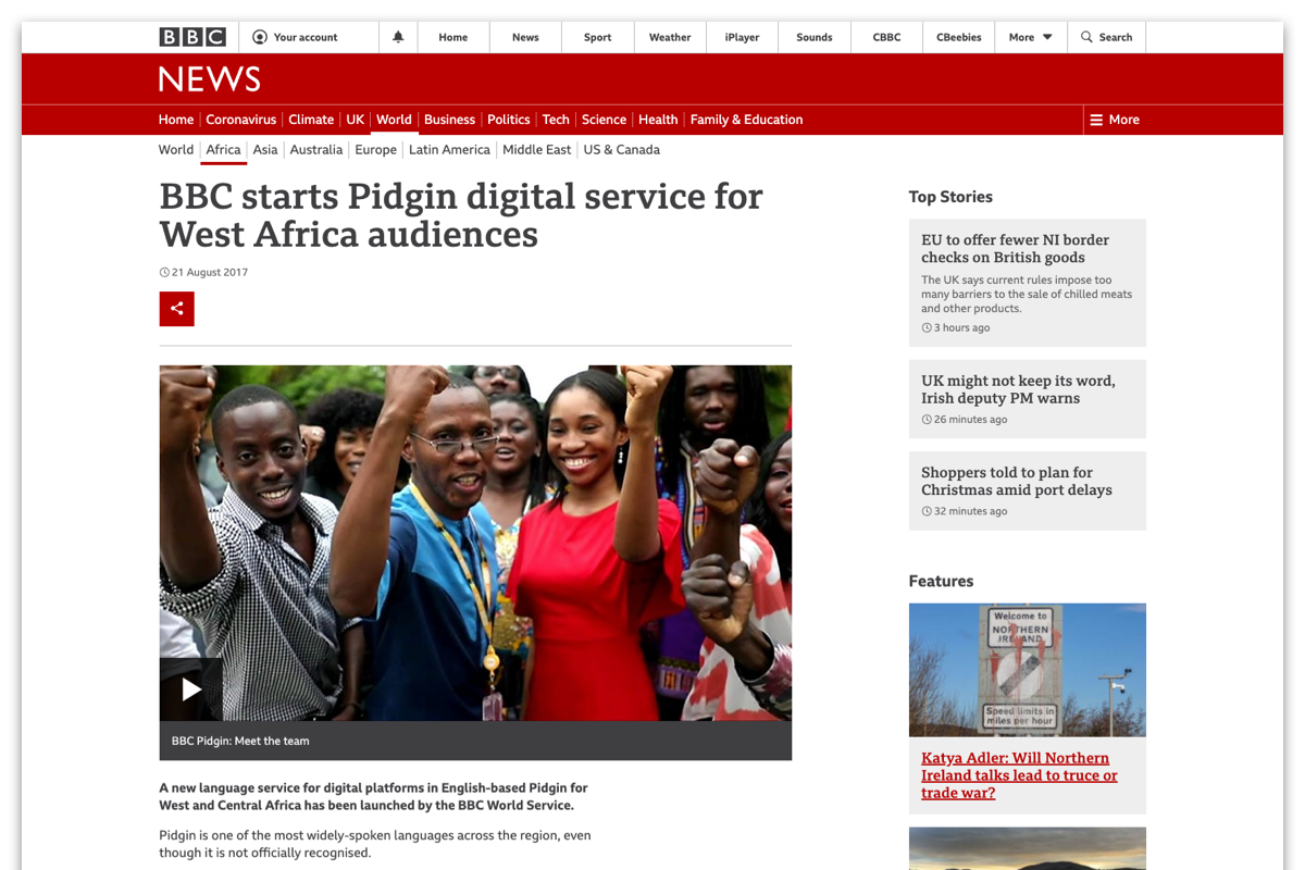
Announcment of Pidgin service launch
The Pidgin service was launched in August 2017, with editorial headquarter in Lagos / Nigeria. With Pidgin the BBC offered three Nigerian languages including Yoruba and Igbo.
We wanted to understand the audiences needs more:
We wanted to understand the audiences needs more:
- What are they looking for in a news provider?
- How do they consume their news?
- What are the challenges and opportunities?
- Team:
Product Manager and Researcher - Responsibilities: Workshop facilitation, focus group, early concept testing, research analysis, qualitative research, concepts, prototyping
- Project timeline:
10 weeks
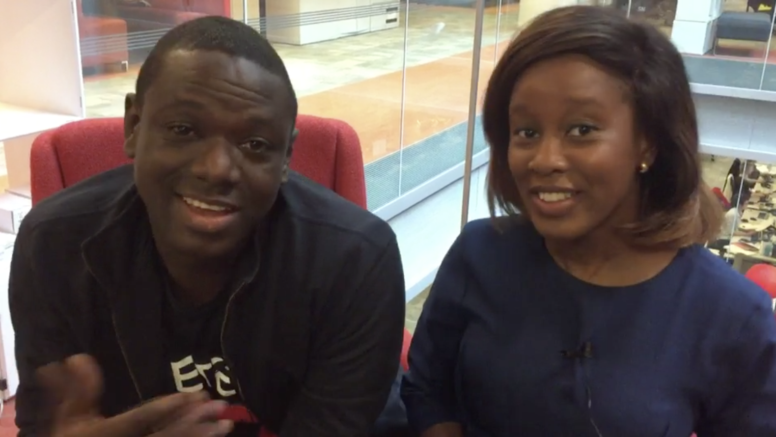
Nigerian journalists announcing the BBC Pidgin website launch
Understand
The Editorial team on the ground provided some key insights around the general news consumption:
- Audiences mostly switch between different languages, they mostly speak at least one and English
- Mobile is most used device
- Being up-to-date and on-trend are their central news needs
- Video usage is limited due to high costs and connectivity challenges
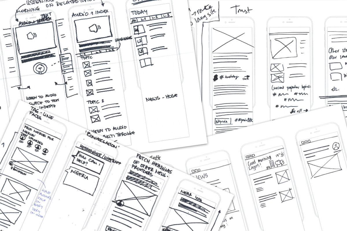
Create
We held four design sprints with focuses on different aspects each
- Low connectivity
-
Trust
-
Share
- Navigation

This little buses are mostly used by the population to commute to work and back
Learn
In two focus groups we interviewed:
the editorial team first to find out more about their audience insights and data. Then presented them with our designs to capture their feedback.
a group of 12 users, BBC and non-BBC users, age range from 20 to 50.
In the first part we captured their usual news consumption, what they were looking for and what they struggled with.
The second part consisted of the design crit: how did they feel about the designs and what would they change, what are their needs.
“It’s like the world can see us now!”
A participant when we showed them the BBC Pidgin service
Same but different
People were quite tech savvy but in different ways when it came to hacks around connectivity, what apps they used, sharing content or watching videos. While using the hamburger menu, or Logo as home button to navigate was not obvious. We found this with other participants in different countries too.
Clicking through to something can sometimes cost a lot of data, that's why their decision making is very thought through, instead of just a browsing behaviour.
Outcome
The prioritisation was in building a more intuitive navigation based on their needs.
Left, new navigation:
The navigation has been simplified, section items of the site are exposed, including 'home' button.
Navigating to other sites for Africa now in the hamburger menu.
Right, old navigation:
All section items hidden in the hamburger menu.
'Home' button is the News Logo.

New (left) and old (right) navigation side by side
©Ngan-Thi Dang